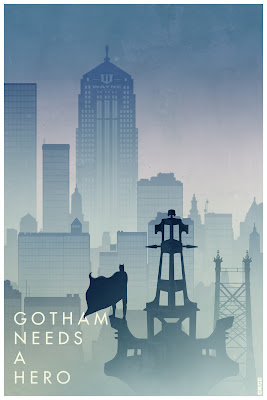
 Loving the build up to TDKR and can't wait to see it in just a little over a week, on the UK's biggest screen (BFI IMAX ). Below are some really cool fan-made posters and a re-cut trailer (in the editing style of Girl with the Dragon Tattoo) that some hardcore fans have created. This grassroots activity is adding to the hype created through the masses of official online and offline marketing. You can check out more fan-made posters at tumblr. My favourite posters are the graphic design ones but the humour is quite funny in some of them too, such as this one >>>>>>>>>
 Warner Bros and other studios have come to appreciate most types of grassroots production, recognising the benefits of happy fans and free marketing. However when fan-generated content spills into areas that clash with a property's core brand, then (like TDK himself) a studio will defend its territory! WB has frequently filed 'cease and desist' orders (threats of legal action) against fans, to prevent them from producing and sharing their own creations based on WB-owned stories or characters. <<<<<<<<< This poster hints at some of the most keenly fought against fan-art and fan-fiction, that which spills into erotica. Some studios believe fan-generated erotic content, which is inspired by their characters could be confused with officially produced materials and dangerously blur the edges of their brands' identities.
This could potentially be a problem for WB, as it battles to keep Batman dark, but not too dark for teenage audiences. Teens make up a key segment of the target audience for the Batman franchise and its related products such as action figures and costumes. Therefore WB definitely doesn't want TDKR to be thought of as too 'adult' by either parents (who might refuse to cough up cash), or national licensors (who might already be minded to give it a 15 certificate instead of a 12A, due to the "intense scenes of violence and action".


